Jarrod Armour
UX Writer & Content Designer
Handshake App
Background
Handshake is a mobile app for freelancers and small business owners to collaborate on projects, including creating projects and budgets, tracking progress, and handling payments.
Task
I provided the UI text for mockups of the app to ensure consistent voice, tone, and style throughout the experience.
Tools
Figma, Google Docs/Sheets
Timeline
In January 2021, I completed this project as part of a certification in UX writing from the UX Writers Collective.
Starting off
-
Researched how freelancers manage their projects and what concerns and issues arise when freelancers and business owners work together
-
Explored various popular freelancer platforms in both mobile and desktop versions
-
Reviewed and analyzed my findings to inform copy choices that would match Handshake's voice and be clear and understandable for users new to freelancing
What I did
I made my UI edits directly in the mock ups in Figma using a vibrant, noticeable orange.
Also, I suggested new copy-based solutions right in the designs to improve usability.
For example: The Welcome screen

Original version

My suggestions:
Include the name of the app so users know they've launched the right one
Highlight benefits for users to entice them to proceed
Change the button copy to be more friendly and inviting
Add an option to log in if users are returning and already have an account
Revised version
Getting started with Handshake
After the Welcome screen, the flow is split for returning vs. new users to to focus on their experiences individually.
The Sign up and Log in screens

Original version
(a single screen)

For returning users:
-
Greet returning users with a welcoming headline
-
Update the form with clear title and labels so users know what to do
-
Include a way for users to recover their passwords
-
Add a much needed button so users can proceed! (matching the CTA to the form title)
-
Offer single sign on (SSO) to make this easier for users
-
Provide an exit for new users who are here by mistake
Revised version
Setting up the first project in Handshake
Freelancers and business owners proceed to creating their first project in similar flows, so for brevity, I share my revisions for freelancers.
Original freelancer set up


My suggestions for a revised flow

Revised version
-
Make the flow more cohesive with actionable, instructive verbs in the headlines and a bit of microcopy to remind users where they are in the flow
-
Revised form labels to also include a verb so users know what info to input
-
Add tooltips and microcopy to inform users how the app uses their info or reassure them at critical moments
-
Include an extra field and hint text so important info (rate, time, and cost) are clear and easy to input and view
Tooltip example — Set your hourly rate:
Get expert advice from Handshake's FAQs about hourly rates
The link text is more accessible with the fictional name of the destination website included.
Keeping projects organized in Handshake
Once a freelancer or business owner creates a new project, they're ready to track progress, request or send payments, and send messages to partners.
Original screens: Ongoing use, Freelancers
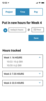


My suggestions for a revised flow: Ongoing use, Freelancers

-
Include a verb-led title for the form so freelancers knows what to do
-
Lead the hint text of the form fields with simple verbs so users know what to enter, plus adding the missing field for Total Budget
-
Change the microcopy for budget approval and add the date so the context is clearer for users
Tooltip example:
To make any changes to this budget, communicate with your partner. Learn more at Handshake's FAQs about budget approval
Again, the tooltip uses an accessible link including the destination article's title.
Revised version
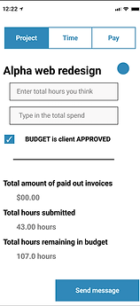
Original screens: Ongoing use, Business owners


My suggestions for a revised flow: Ongoing use, Business owners

-
Make the nav along the top parallel with 3 nouns, using Progress instead of Time to capture a feeling of motivation and movement
-
Simplify the subheads so the point of each section of content is clearer
-
Add the actual description of the project to see the full effect of the text in the design
-
Change the CTA of the button to be shorter; ask the team if business owners can update the description as well as budget terms here